Archive for the ‘ Graphic ’ Category

How to get page numbering to start where you want it in InDesign CS5

When you use the A-Master and add auto-page numbering, InDesign counts each page from the very start of the document.

If you have a cover at the start of your document, you may have one or more pages where you do not want the pages numbers to appear. Since the page numbers don’t appear on these pages, you probably don’t want them counted in the page numbering sequence either.

This tutorial will show you how to adjust your page numbers so you can have them starting where you want.

BEFORE

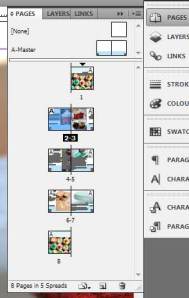
Above is my document before I made this tutorial. You can see that I have a cover page with no page number on it, but the actual numbering starts with number “2” on page 2.

What I want is for the page numbering to start on page 2, but instead of saying “2”, I want it to say “1”.

AFTER

Note: suggest you do this process only once you are happy with the final layout of your document, as it does require you to turn off shuffling of pages.

1. In your pages panel, double-click on the page icon where you want to start your numbering. In this example, I want to choose page 2, and have the actual page number say “1” on the page. Page 2 is selected in blue below:

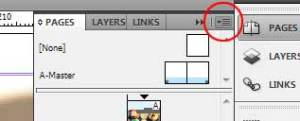
2. The Pages palette has a menu you can access from the button on the top right of the panel. This gives you more options. Uncheck the option Allow document pages to shuffle.

3. Click on the Pages palette menu button again. Choose Numbering and Section Options…:

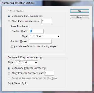
4. Select Start page numbering at and set the number in the box to be “1”. This will work with either a left- or right-side page (i.e. you can make an “even” left-side page into page 1. Nifty!

5. You may see a warning screen appear. It’s simply telling you that some of your pages will have identical page numbers. We will fix this later. For now, just click OK.

6. Your page numbers should have automatically renumbered.

7. If you want to remove page numbers from any of the pages in your document you have two choices:

  • Apply a different master page which doesn’t contain any page numbering, such as the master called “None”. To do this, select the page you want to apply the different master page to, and click the Pages palette menu button. Choose “Apply master to pages…” and then choose the master page you want to use instead of A-Master.

  • Or, you can go to the Pages palette menu, and select Override all Master page items. This will unlock the items from the master page, so you can then select and delete the bits you don’t need, such as the page numbers.

Note that you may run into issues if your document has duplicate page numbers from doing the above steps. I got this message when I tried to apply a new master page to the cover page (1):

Basically it’s telling me it can’t apply the master page I want, because there are 2 x “pages 1”s in my document. InDesign is confused! Poor lil’ InDesign.

To fix this all you need to do is rename one of the “page 1”s. To me, it makes more sense to rename the cover page 1, because it’s not included in any page numbering sequence.

Go to the Pages palette menu and select “Numbering and section options”. I added a Section Prefix of “A” so InDesign could distinguish between pages A1 and 1. After doing this InDesign will let you change the master page of A1.

Advanced Pen Tool – Illustrator

Illustrator Pen Tool Shortcuts


Get the Pen tool = P

Get the black arrow = V

Get the white arrow = A

Pen tool best practices:

  1. Work in one direction (i.e clockwise OR anti-clockwise) don’t change directions mid-drawing.
  2. Keep the handles of your curves pointing in the direction you are drawing. If they point backwards, you will get nasty (or perhaps useful) bumps and squiggles.
  3. Always work with closed paths. No matter how skinny the line. * note that lines created with the line tool should also be converted to paths/outlines before artwork is handed off to anyone. This is because lines tend to scale (get thicker or thinner) when artwork is scaled. Check the scaling preferences in Edit > Preferences.
  4. A single click will make a corner point. This has no handles.
  5. A click’n’drag will make a curve point. This has handles.
  6. When tracing artwork, always put the artwork on a locked layer.
  7. It is usually best to use a semi-transparent colour to trace with, rather than a line. The thickness of the line can obscure the actual path.
  8. Aim to create as few points as necessary.
  9. Make extrema points to start with. They are a good place to start, before you get a feel for where the “next point” should go. Extrema points are those points situated on the horizontal or vertical flatness of a curve. Use the Shift key to ensure accurate 90° lines.
  10. Once you have made a path, you will probably want to go back and fix it in places.
    1. Use the black arrow to move whole paths (V) (Also, usually not much use if you have drawn accurately over the source image  😛 ).
    2. Use the white arrow (A) to move points.
    3. Hold Alt and click’n’drag on an existing point to give it new handles. Great if you want to add or adjust a curve.
    4. Hold Alt and single click on an existing point to remove handles. Good if you want to remove a curve.
    5. When you have the Pen tool (P) in use, you may want to quickly jump back to the black arrow to select a path, or deselect a path. Instead of using (V), while the pen tool is in use, just hold down Ctrl and click. Same as black arrow tool, quick and useful. J
    6. Sometimes it’s useful to adjust both handles of a point at once (i.e., adjust the curve on both sides of the point). Use the white arrow (A) to do this.
    7. Other times you only want to adjust the handle on one side of a point (i.e., adjust the curve on one side of a point). Use the chevron tool to do this. To access the chevron tool (don’t ask me the “proper name”!) you need to have the pen tool in use (P). Hold down the Alt key and a little > shape will appear, tilted, next to your cursor. Use that to grab the handle you want to change. * Note: if the point you want to change is an extrema point, remember to also hold the Shift key to retain perfect 90° lines.

Pathfinder Tool

*Note:  To cut a shape out of another shape, you need to be working only with closed paths. Open paths, text and lines will NOT work.

The bottom left icon (Divide) will cut or punch a shape out of another shape, much like a cookie cutter cuts out a shape from dough. The dough should preferably be at the bottom.

  1. Stack two closed-path-objects over top of each other. They can overlap completely, or partially.
  2. With both paths selected, click the Divide icon. Your shapes will now be cut, but they will be grouped.
  3. Ungroup the shapes. Ctrl + Shift + G to ungroup.
  4. Using the black arrow (V) select the piece you want to remove, and either move it or delete it. Voila, one hole. J

The top left icon (Unite) will join two closed paths together. Same step one as above, then click Unit icon. That’s it, you now have a single path from what used to be two or more separate paths.

Align Tool

You should be able to work out the basic “align-left” “align centre, and “align top” tools easily enough.

*Note: Before aligning or distributing anything, always check what you are aligning stuff to. See the icon in the bottom left. Usually you want to align to selection (things you have selected on the page), but sometimes you may want to align stuff to the page.

You have two choices with the Distribute tools, you can either distribute centres, or distribute spaces.

Distribute centres is great when all your objects are the same dimension (i.e. same width if you plan to distribute horizontally). It is a pain if you have objects of different dimensions though; then it just makes a mess.

That is where distribute spaces comes in handy. It makes the space between all the objects you have selected even. A good example is text (turned to outlines), which are often varied widths.

WITTart Website: SNEAK PEEK

I know you love “sneak peeks” at what I’m working on, so here is another!

I tutor Graphic and Web Design at WITT, and now I am working on creating a website for the art department.

The site address is www.wittart.co.nz

Currently, the curtains are drawn and you will only see this:

But over the mid-semester break things have been happening. Below you can get a glimpse of what I’ve been working on. All the content is just dummy-content, and I’m am liable to change the entire look overnight yet, but it gives you an idea of where it’s going.

Lots of people have been asking when the final site will be up and ready??? The short answer is “when I get some time to work on it!” This job is  a very large WordPress powered site, and it needs to be done right. Some of the features I’m including are:

  • Galleries of student work
  • A blog of news and events for the department
  • The ability for other tutors to upload and manage sections of the site
  • Timetables
  • Tutor galleries and profiles
  • Contact info and social media links
  • Tutorials and resources for our students
  • Information on preparing a portfolio of work, and enrolling
  • Info on what it’s like in each of our qualifications
  • Articles and photos about the cool new Art Block (F Block) which is currently being renovated especially for us!
  • And heaps more… ooh it should be good!

Gathering the content is the next big effort. As well as getting a bit of feedback from you kind folks about what you think of it so far… *hint hint*  😀

Yoga.org.nz Website Design: SNEAK PEEK

This project was a bit of fun: creating a visual design for the WordPress driven site Yoga.org.nz

Visit the Members Preview area here.

The overall look of the site needed to be modern and calm, suitable for the many different types of people who enjoy yoga.

I started by searching for a strong colour palette, which led on to the logo design (note: I may yet totally re-create that logo – the swirly bit was a nice idea but I’m not convinced!)

Because this is just a visual design, all the elements have to belong to a logical set of design rules. In this way, the kind folks at EarthFirst Infotec who are building the site in-house are able to continue the theme throughout a massive 50 page site, without needed additional designs from me.

The site is still in development, but when it’s launched it will offer a lot of videos on yoga and healthy living. There is even a section to do with vegetarian cooking!

Julia Berry Design

Please welcome my sister, Julia Berry, to the web!

Her first website is due to go online shortly, in the meantime we have put together a holding page for her:

Julia is a print designer and does some extraordinary illustrations. I can’t wait until her portfolio is available for everyone to see! Yay! 🙂